PAGESSA, Visual Identity
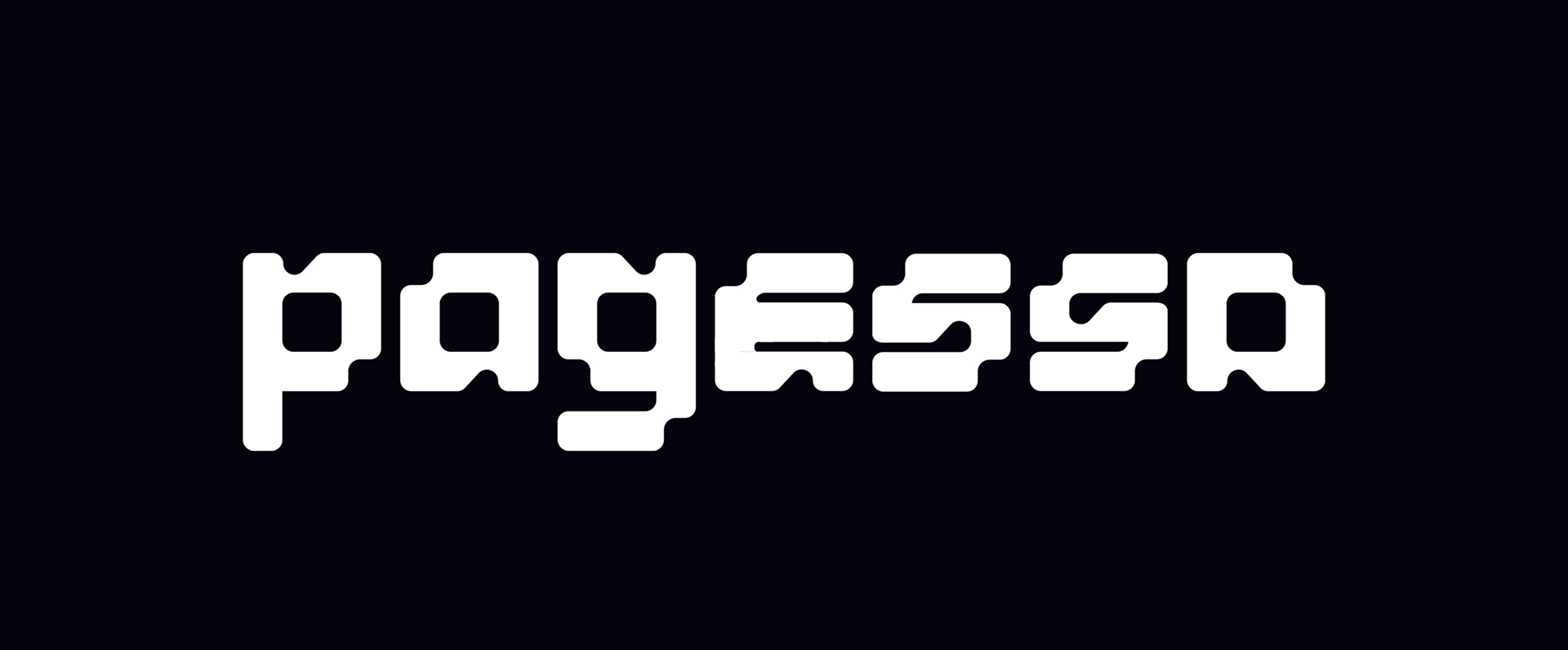
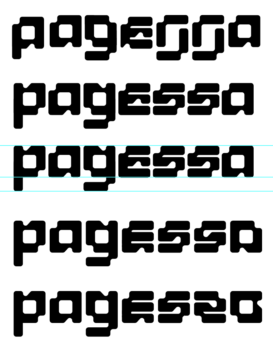
PAGESSA is a cybersecurity project built around the three values: Simplify, Standardise, and Automate. I designed the five custom characters around these brand values. The wordmark has a sleek, sculpted form that feels technical and precise, reflecting advanced security systems and modern digital infrastructure. Its metallic, engineered look communicates strength, resilience, and innovation. This is intentionally balanced with the trustworthy luxury serif tagline below, which introduces tradition, credibility, and human assurance.
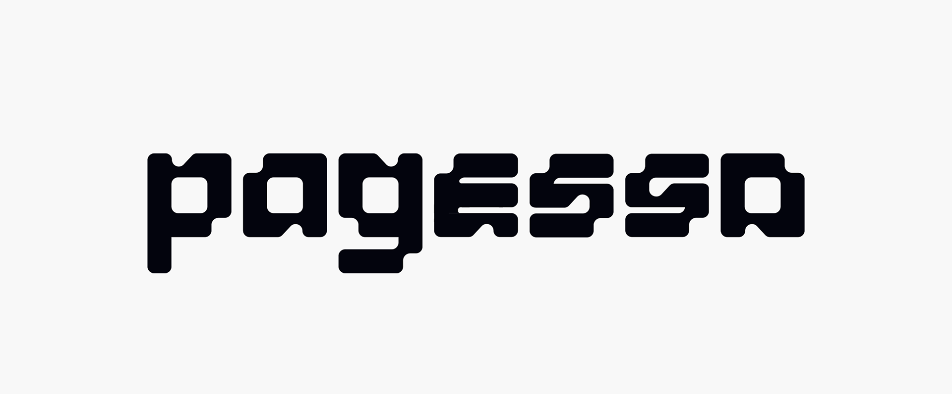
PAGESSA is a cybersecurity project built around the three values: Simplify, Standardise, and Automate. I designed the five custom characters around these brand values. The wordmark has a sleek, sculpted form that feels technical and precise, reflecting advanced security systems and modern digital infrastructure. Its metallic, engineered look communicates strength, resilience, and innovation. This is intentionally balanced with the trustworthy luxury serif tagline below, which introduces tradition, credibility, and human assurance.

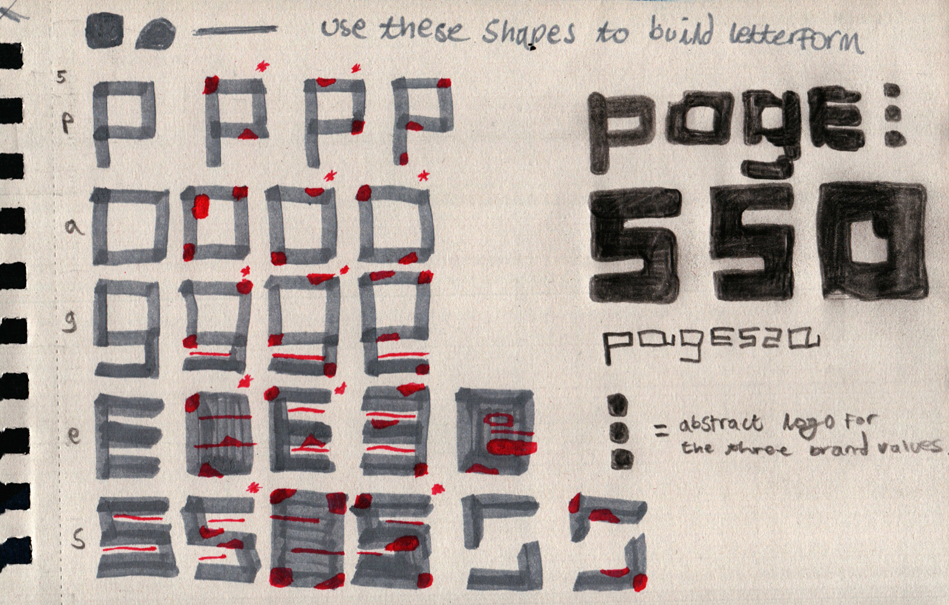
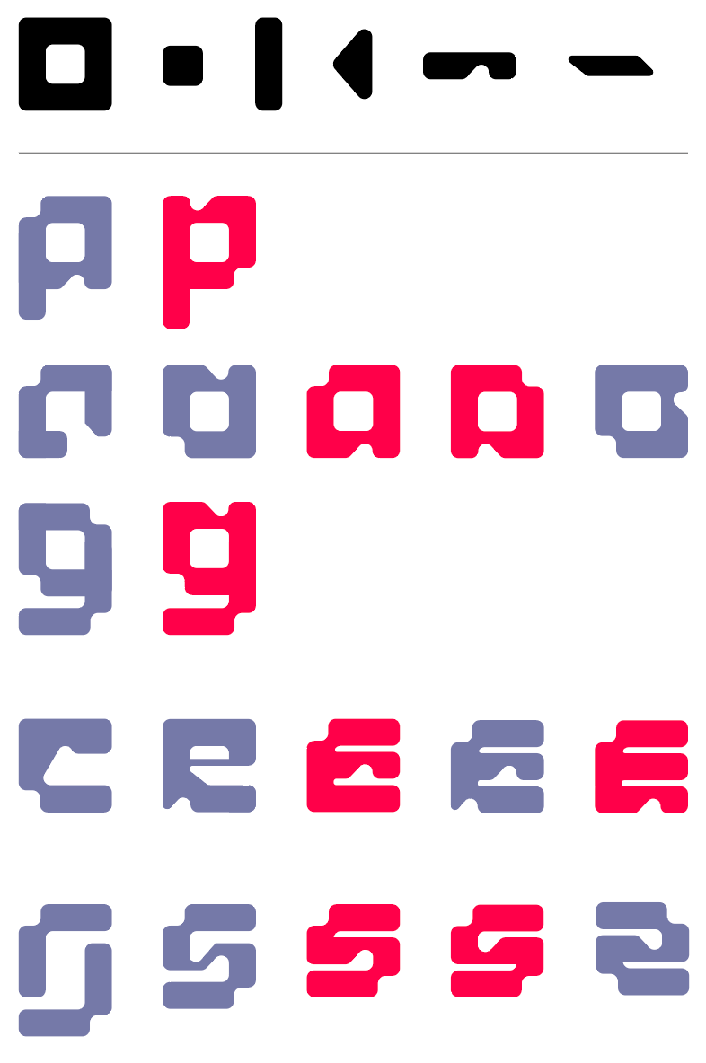
Development
During development, each character went through several iterations to test how well it worked within the overall system. The purple characters mark ideas that were ultimately unusable because they broke consistency, felt visually unbalanced, or caused legibility issues when used alongside other letters. While some of these versions had interesting qualities, they did not translate well as part of a cohesive wordmark.
The red characters were selected as usable because they followed the established shape rules, shared consistent weight and proportions, and felt clear and stable when repeated. The final outcome builds on these strongest forms, bringing them together into a unified wordmark that feels deliberate and confident. This solution worked best because it keeps a technical, engineered feel without becoming overcomplicated, making it clear, scalable, and well suited to a cybersecurity brand built around clarity and trust.
Logo Variations
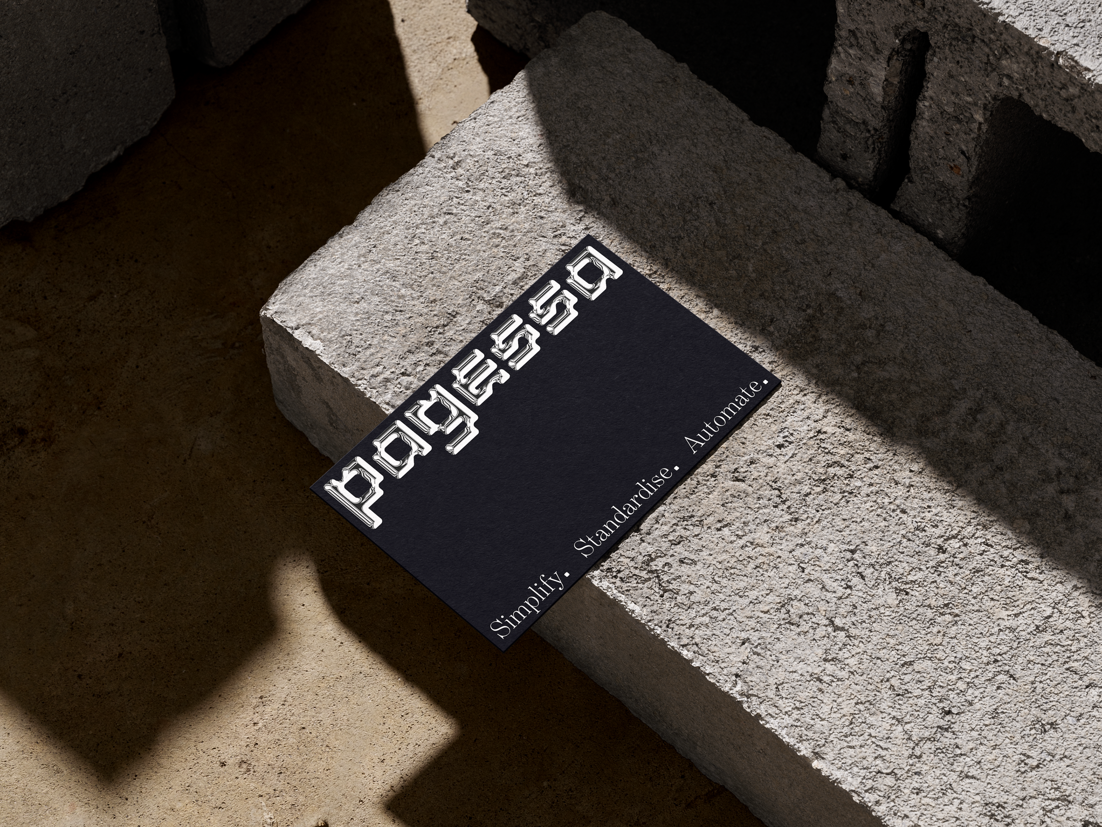
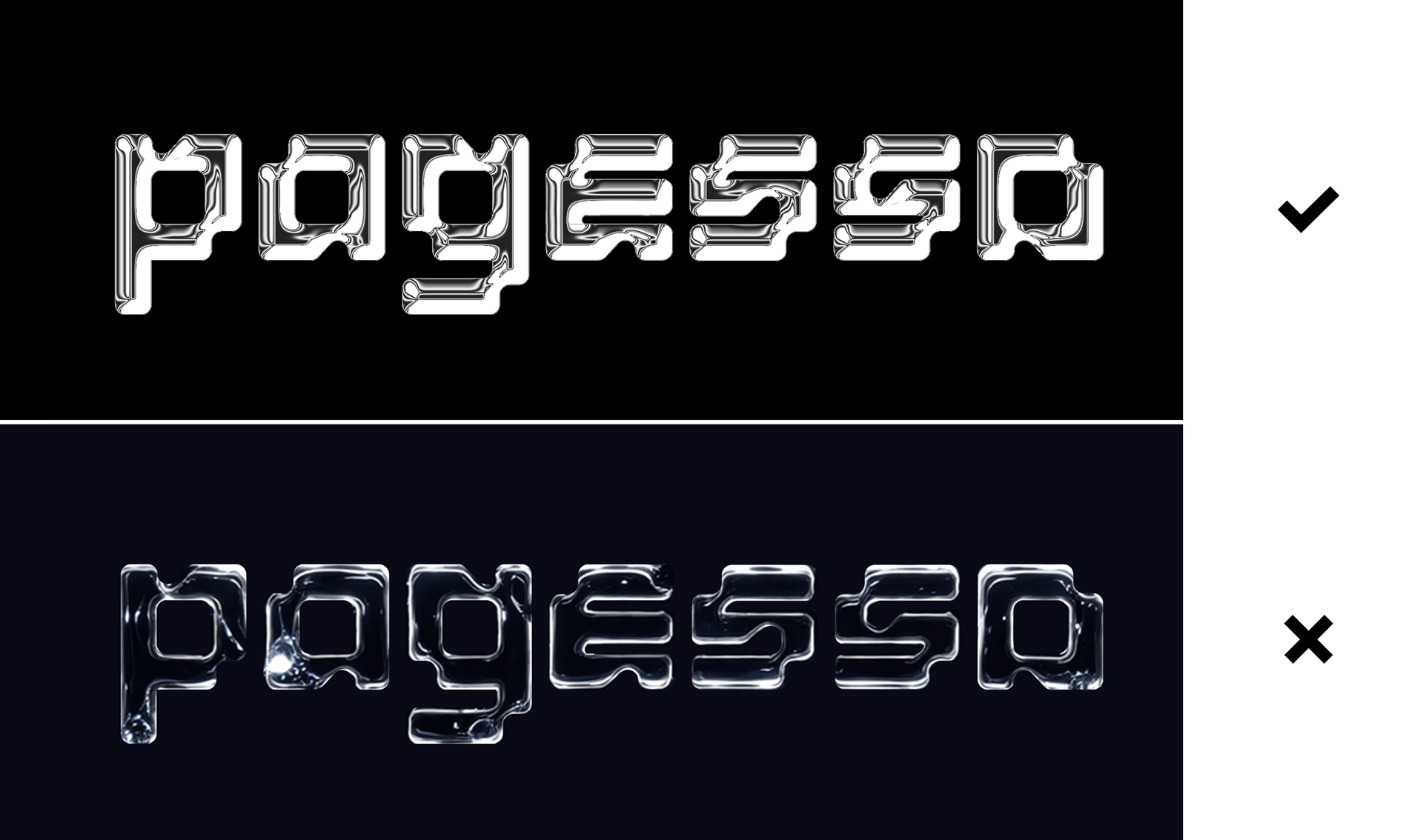
To achieve the chrome effect, I used Photoshop's bevel and emboss tool, which complemented the identity well. I explored developing this further using AI generation, but felt the results were overwrought and inconsistent with the overall direction. The visuals need to communicate technicality, the bottom variant looks too cinematic, as if it belongs in a Marvel movie.
Chrome carries connotations of technology, precision, and impermeability — all qualities central to the PAGESSA brand. The reflective, metallic quality suggests protection and resilience, while the fluid nature of the effect mirrors the adaptive, ever-evolving nature of the field.
Outcome
The contrast between the futuristic custom font and the refined serif creates a strong brand identity: cutting-edge yet dependable. Together, they signal a cybersecurity company that simplifies complexity, standardises protection, and automates trust at an enterprise level.
The chrome logo variant is best suited to high-impact applications where visual weight is an advantage — hero images, presentations, and digital screens where the depth and texture can be fully appreciated. The flat 2D version should be used where clarity and reproduction are the priority, such as small-scale print, embroidery, or any context where the chrome detail would be lost or appear muddy or eligible due to size.