Sustainable Development Goals
Goal 6: Clean Water & Sanitation
Goal 6: Clean Water & Sanitation
As part of a design brief exploring the United Nations Sustainable Development Goals (SDGs), each student was randomly assigned one of the 17 global goals. The task was to respond visually to the chosen goal by producing a poster, leaflet, and short animation aimed at raising awareness and encouraging engagement.
The SDGs are a collection of global objectives set by the United Nations to address the world’s most pressing social, environmental, and economic challenges by 2030. They provide a shared framework for governments, organisations, and individuals to work towards a more sustainable and equitable future.
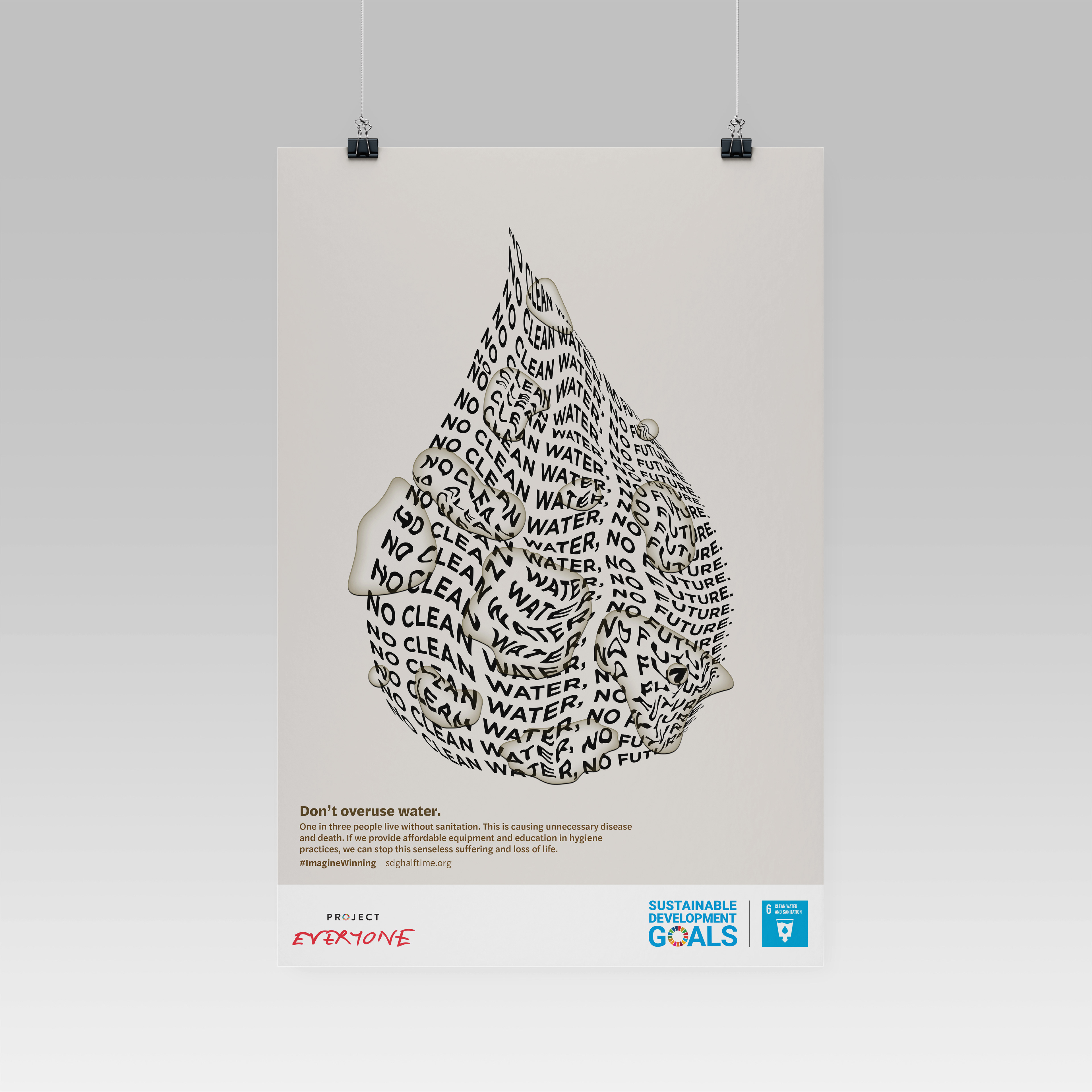
I was assigned SDG 6: Clean Water and Sanitation, which focuses on ensuring access to safe drinking water, adequate sanitation, and hygiene for all.
Led by Greg Bunbury, the project benefited greatly from his experience in design for social impact, helping shape both the concept and final outcomes.
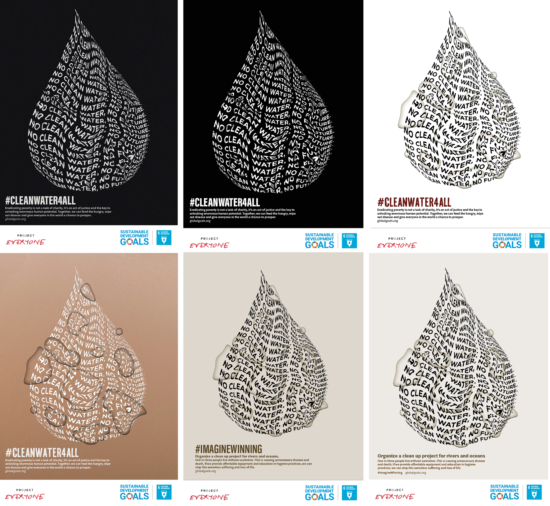
Process
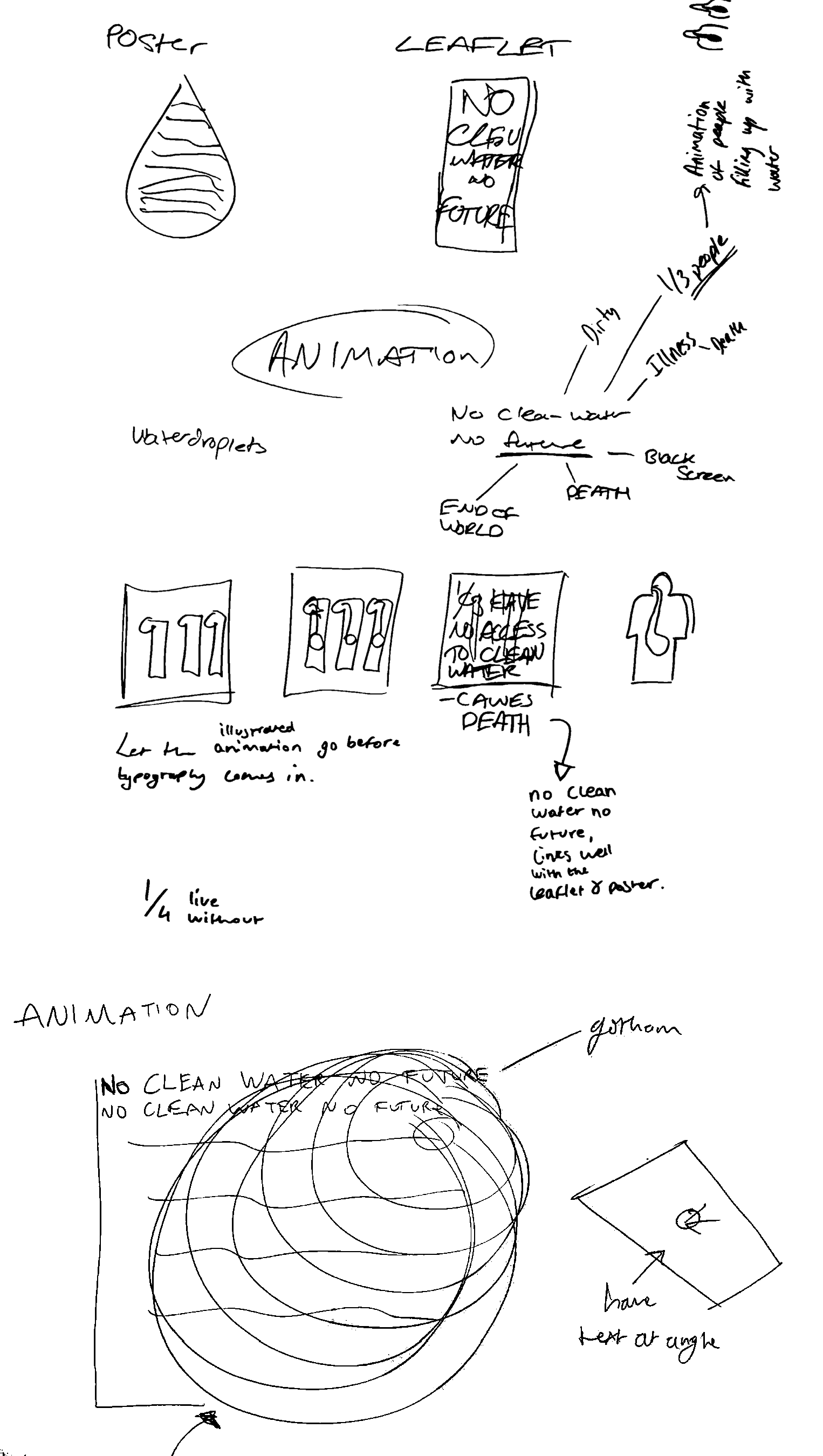
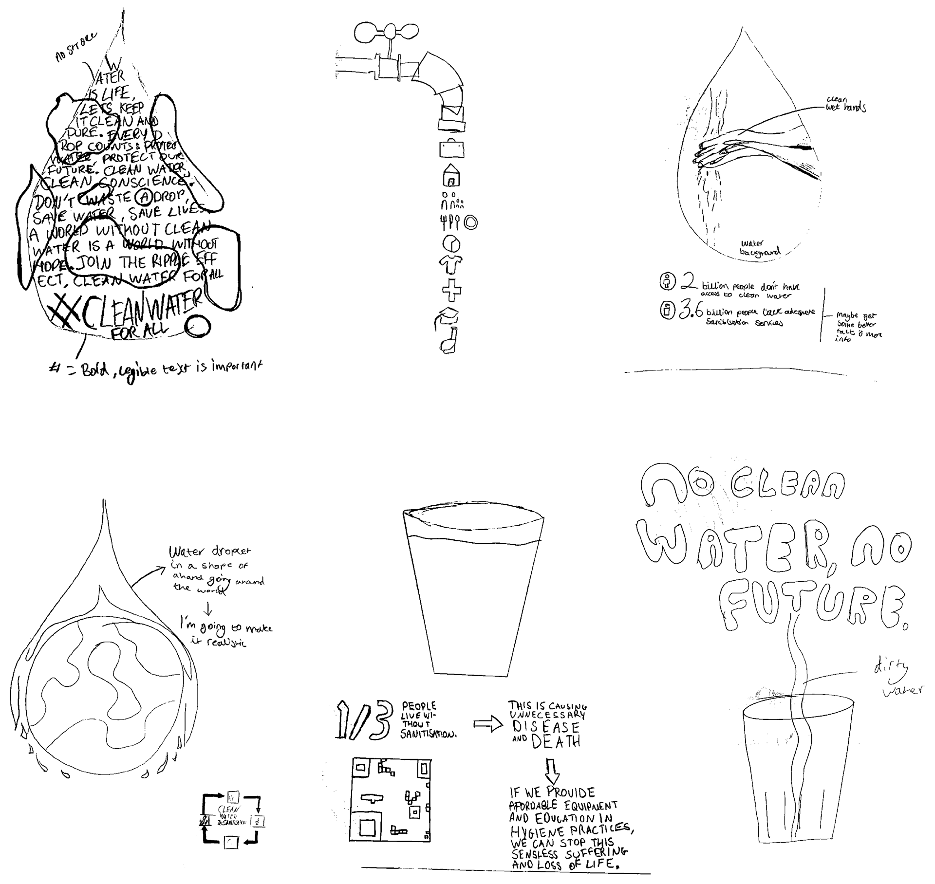
I began by producing a range of scamps to explore different ideas, reviewing the strengths and weaknesses of each before selecting one concept to develop further.
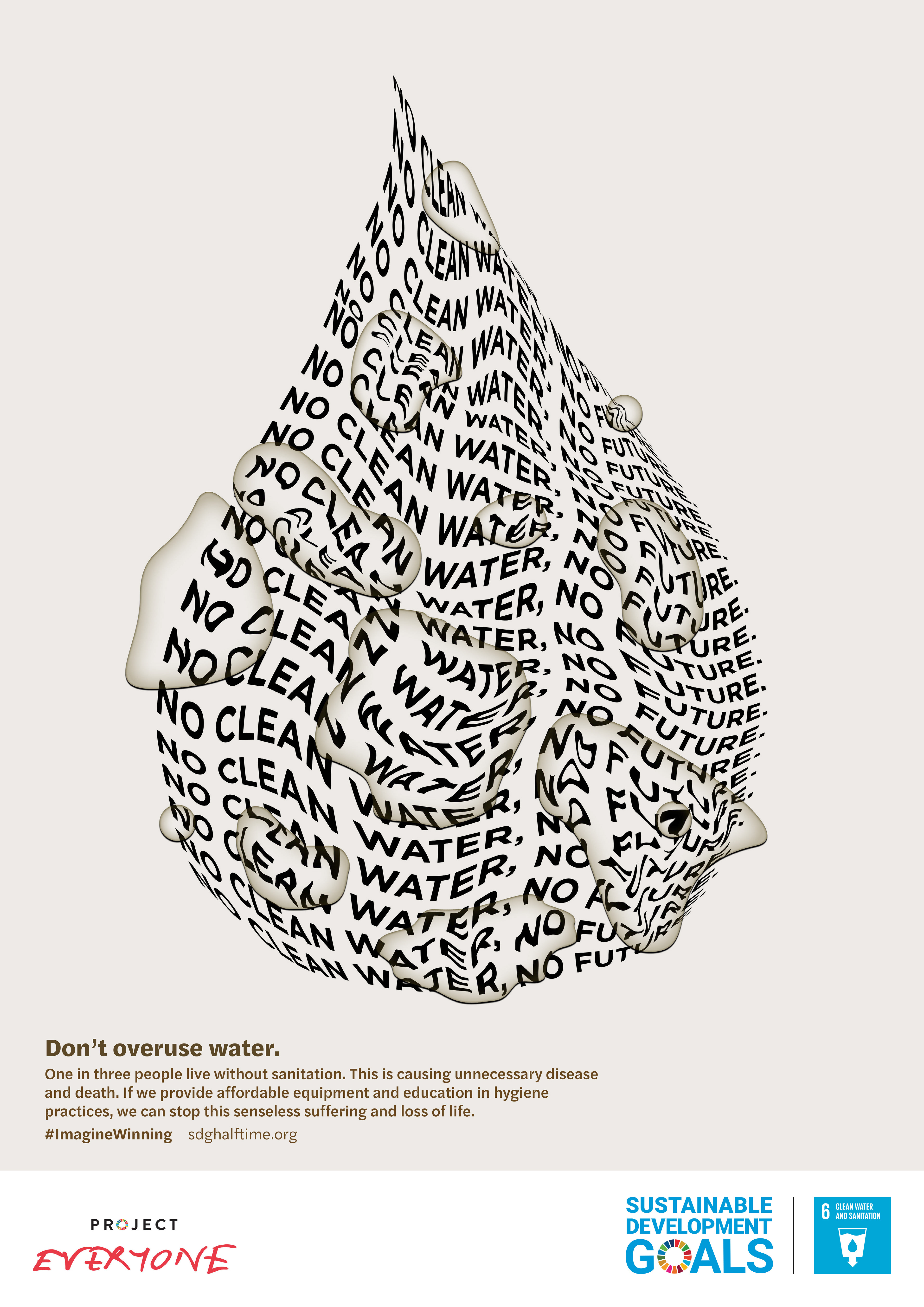
From the refined scamp, I created abstract water droplet shapes in Illustrator by tracing my preferred forms. These shapes were then positioned over the typography and developed in Photoshop using layered effects to create the illusion of realistic water droplets.
To enhance the effect, I selectively liquified the text beneath each droplet layer, distorting only the areas directly under the droplets while leaving the surrounding text untouched. This helped reinforce the sense of interaction between water and type.
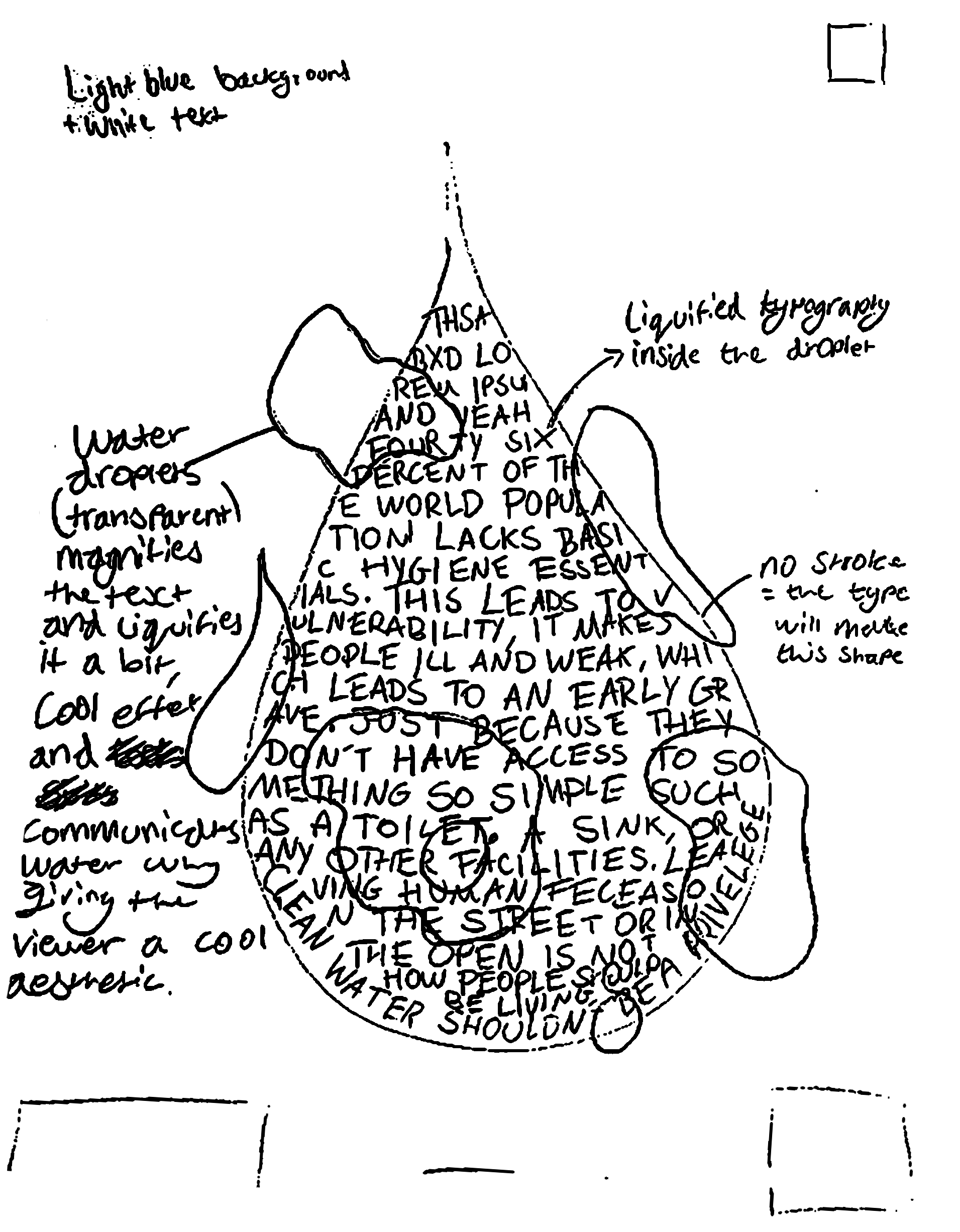
Refined scamp
Development
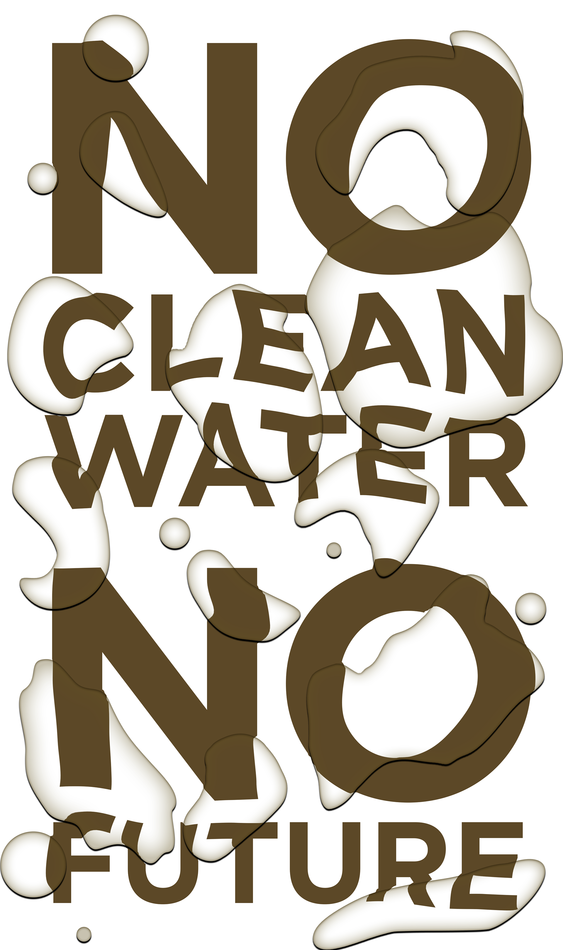
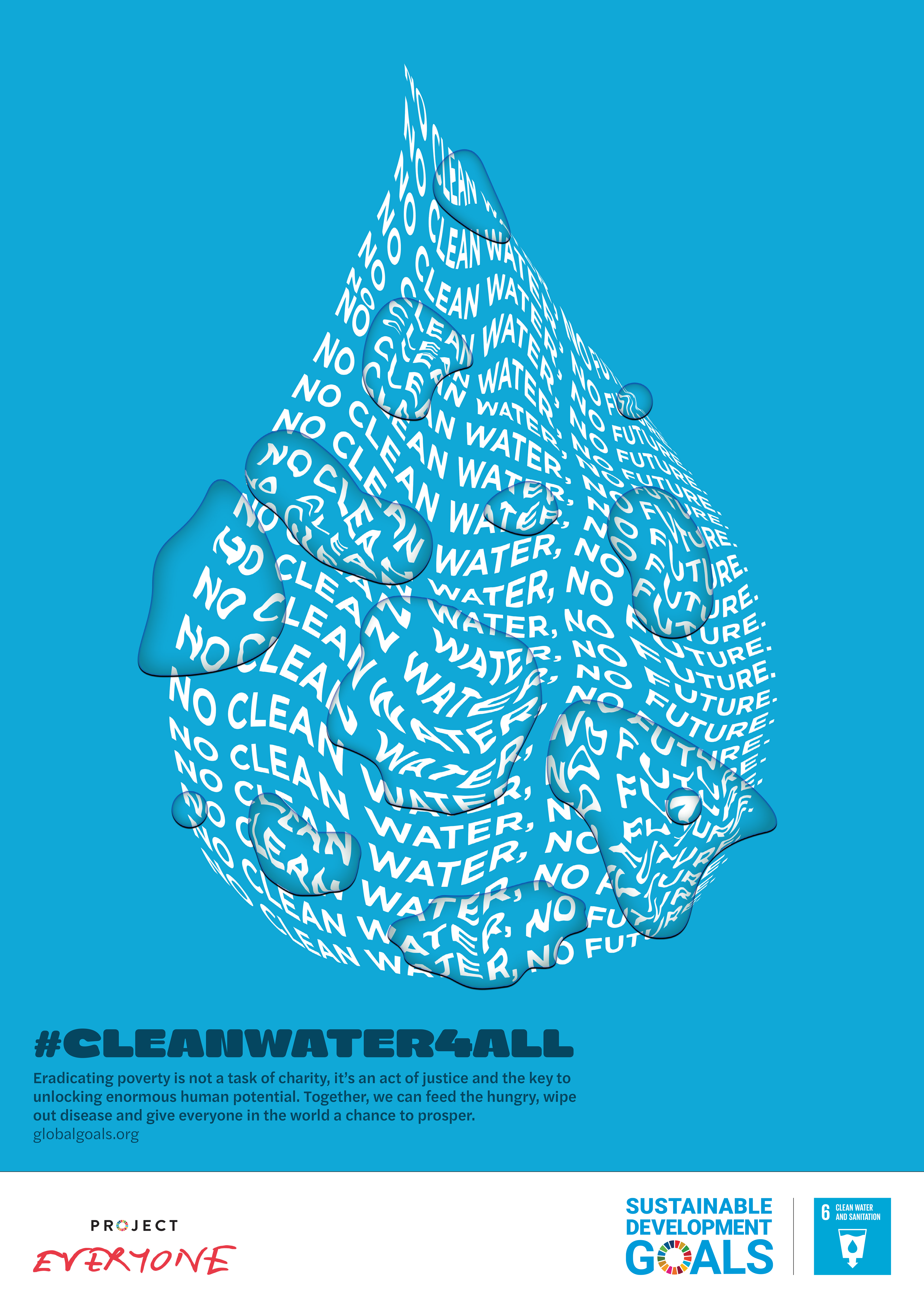
The poster above uses the SDG 6 colour to clearly signal clean water, creating a positive visual contrast to a serious message. This contrast invites reflection, highlighting water access as both a privilege and a global responsibility.
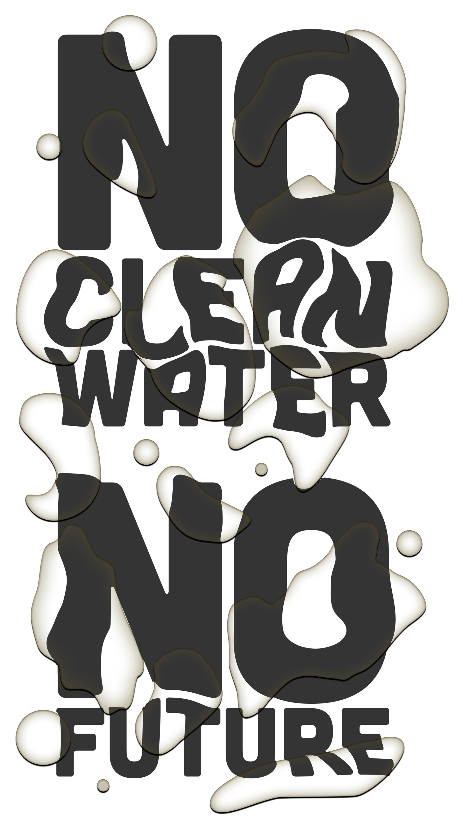
I wanted the design to create more impact and shock value to draw the viewers attention to the negative right away. To do this was to use negative colours and get away from the visual beauty of colour, now changing the water droplets to dirty, and not as appetising.
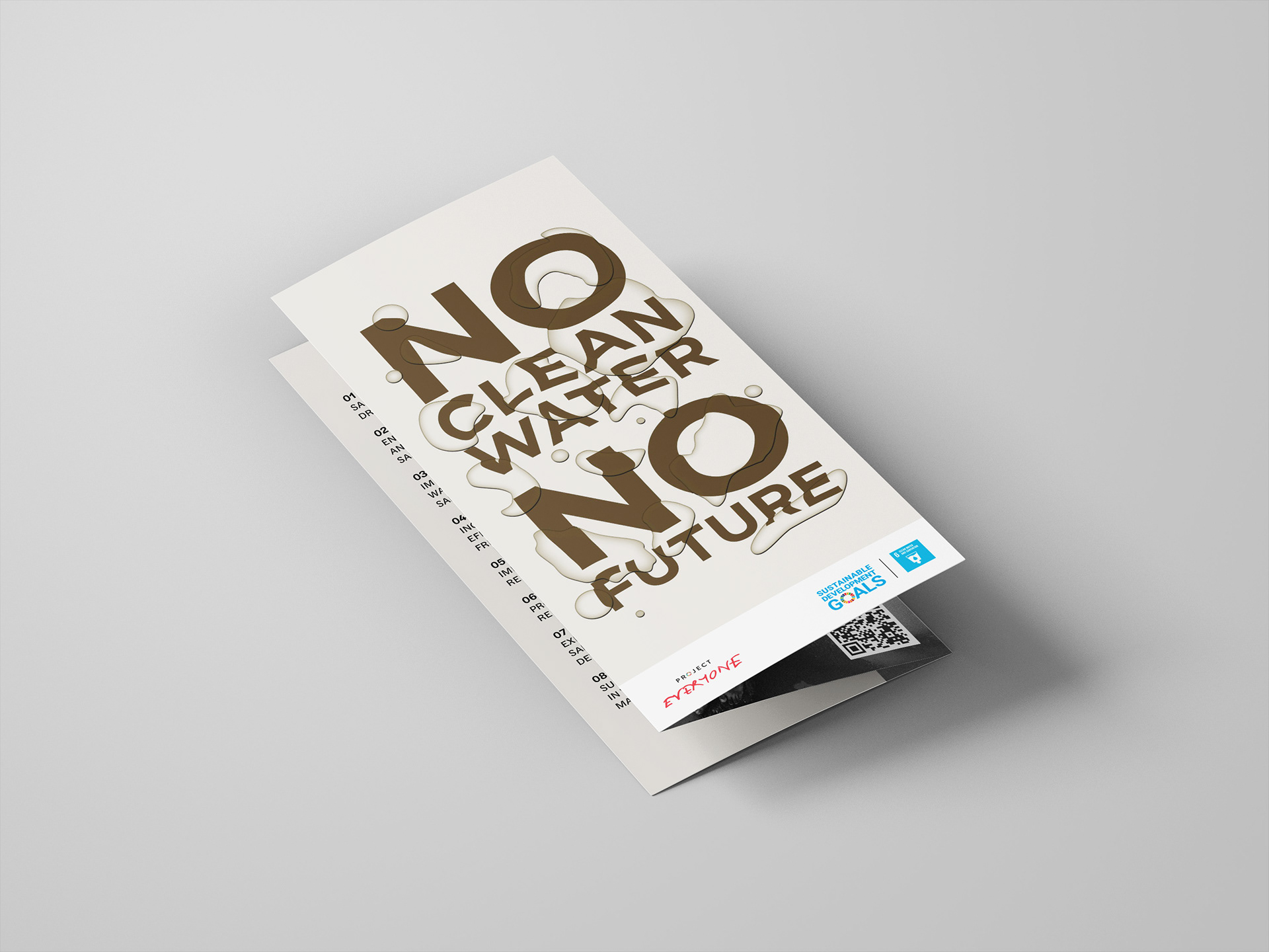
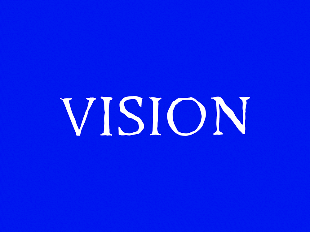
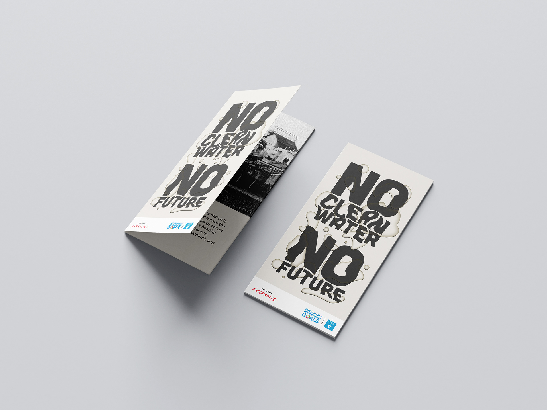
For the leaflet hero image below, I really liked the rounded serif font visually, but it was really too fun and didn't send the serious message across as well as a font with less characteristics. I changed the design so the font and colour so the audience can tell they come as a set.