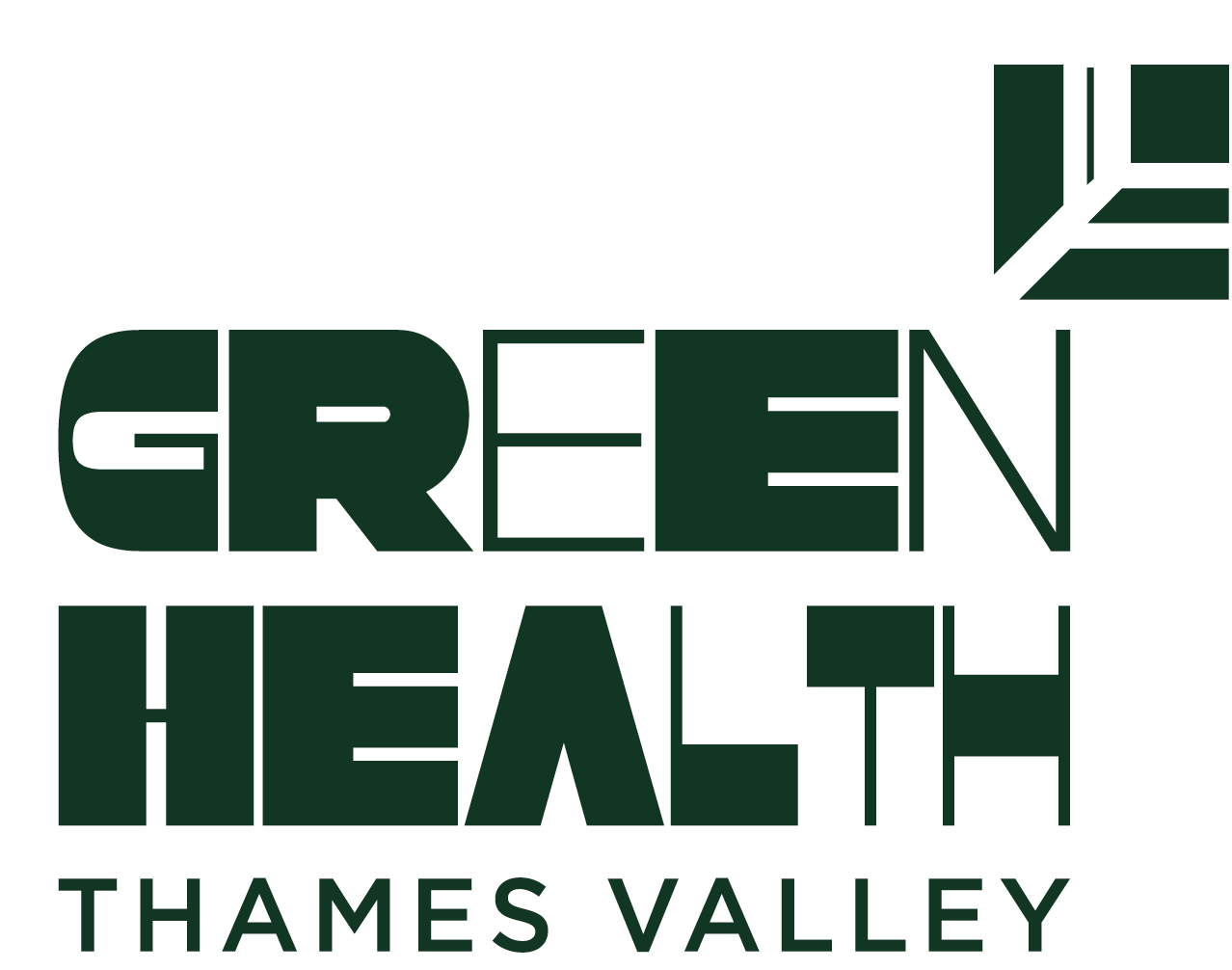
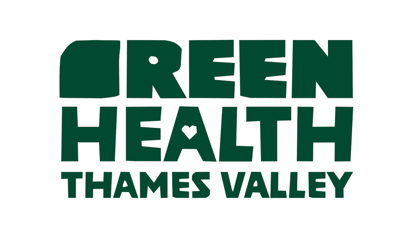
Who are Green Health?
Since 2014, Green Health Thames Valley has provided free, tailored horticulture sessions for mental health support. Unlike other gardening projects, it focuses on intensive, personalised care, helping individuals recover from or manage mental health challenges, social isolation, and socio-economic exclusion. Gardening is recognised by health professionals for its therapeutic benefits.

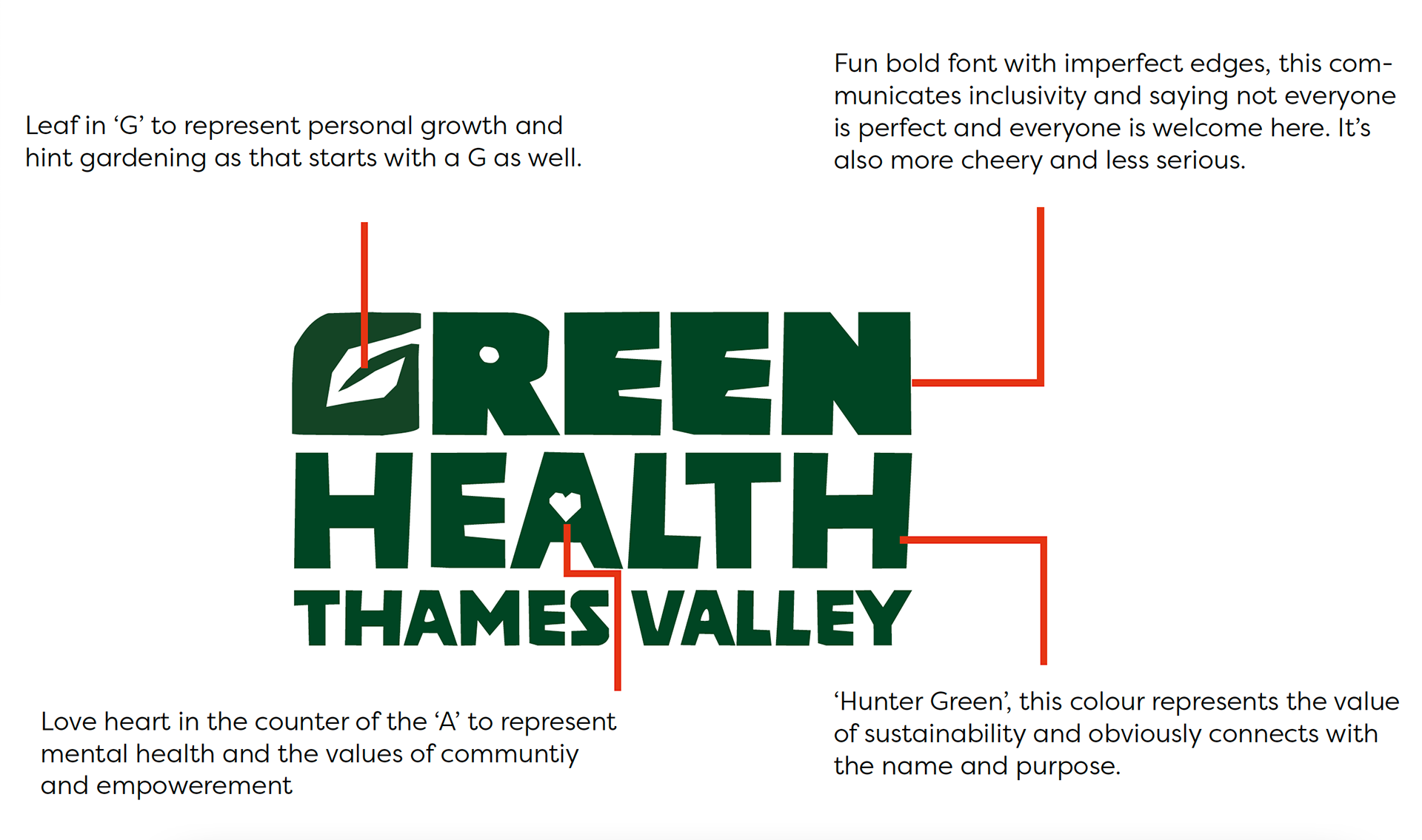
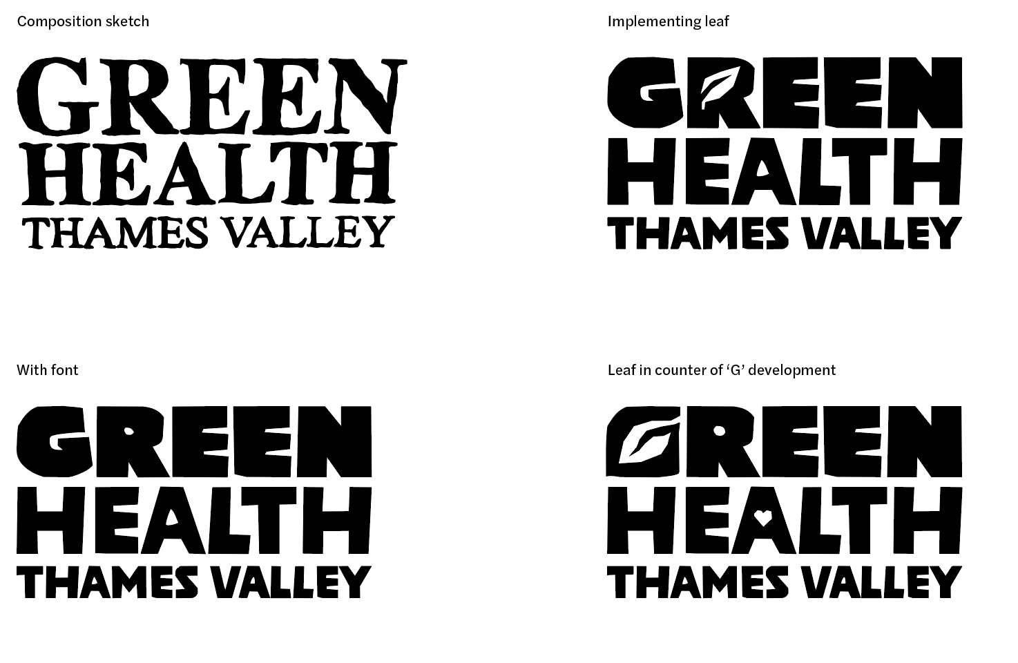
Logo breakdown
Leaf in ‘G’ to represent personal growth and hint gardening as that starts with a G as well. Love heart in the counter of the ‘A’ to represent mental health and the values of communtiy and empowerment. The fun bold font with imperfect edges, this communicates inclusivity and saying not everyone is perfect and everyone is welcome here. It’s also more cheery and less serious.
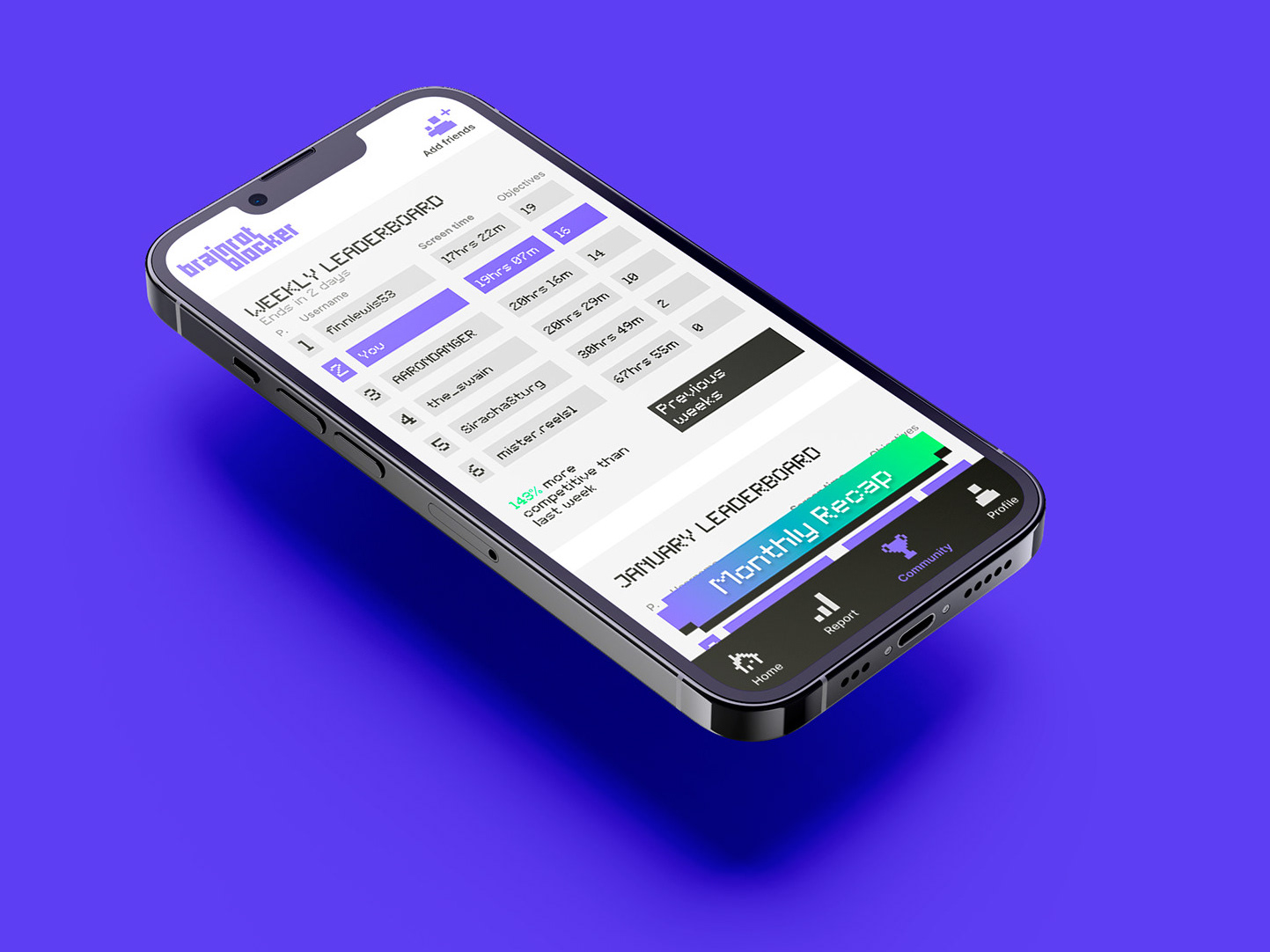
Website prototype
I prototyped a website for them. Applying our brand guidelines. A link is provided to demonstrate the flow of the website mockup. The website is cleaner and more navigable for users than what you have now for your members that may have difficulties using a website in mind. Straight away I removed two or three tabs which made it less crowded and simplified the content to create clarity.
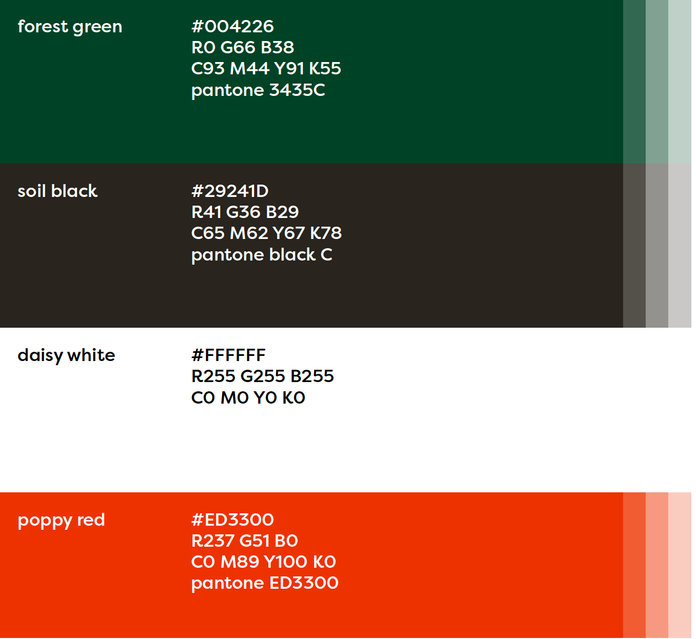
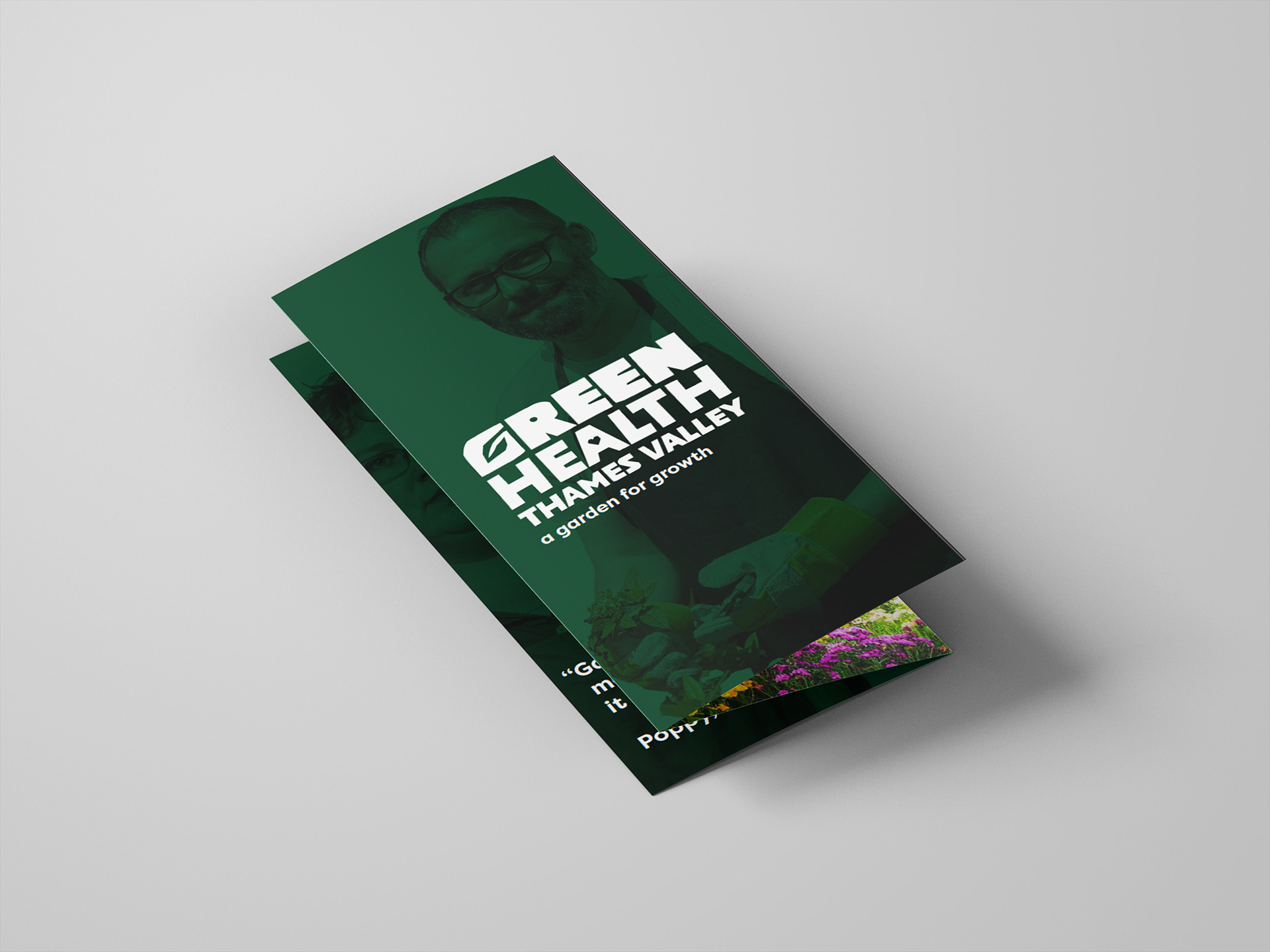
Behind the colours
The chosen colours are natural, calming, and strong, reflecting the nurturing, grounded spirit of Green Health Thames Valley, inspired by the garden.
The primary colour, forest green, represents growth, nature, and support. It’s used for key brand moments, such as backgrounds, headings, and elements where trust and stability are essential.
Soil black provides a strong foundation for text and structure, while white brings space and balance to every design.
The secondary colour, poppy red, is our action colour. Inspired by flowers in the garden, it’s bold and energetic, used to draw attention to buttons, calls to action, and key highlights.
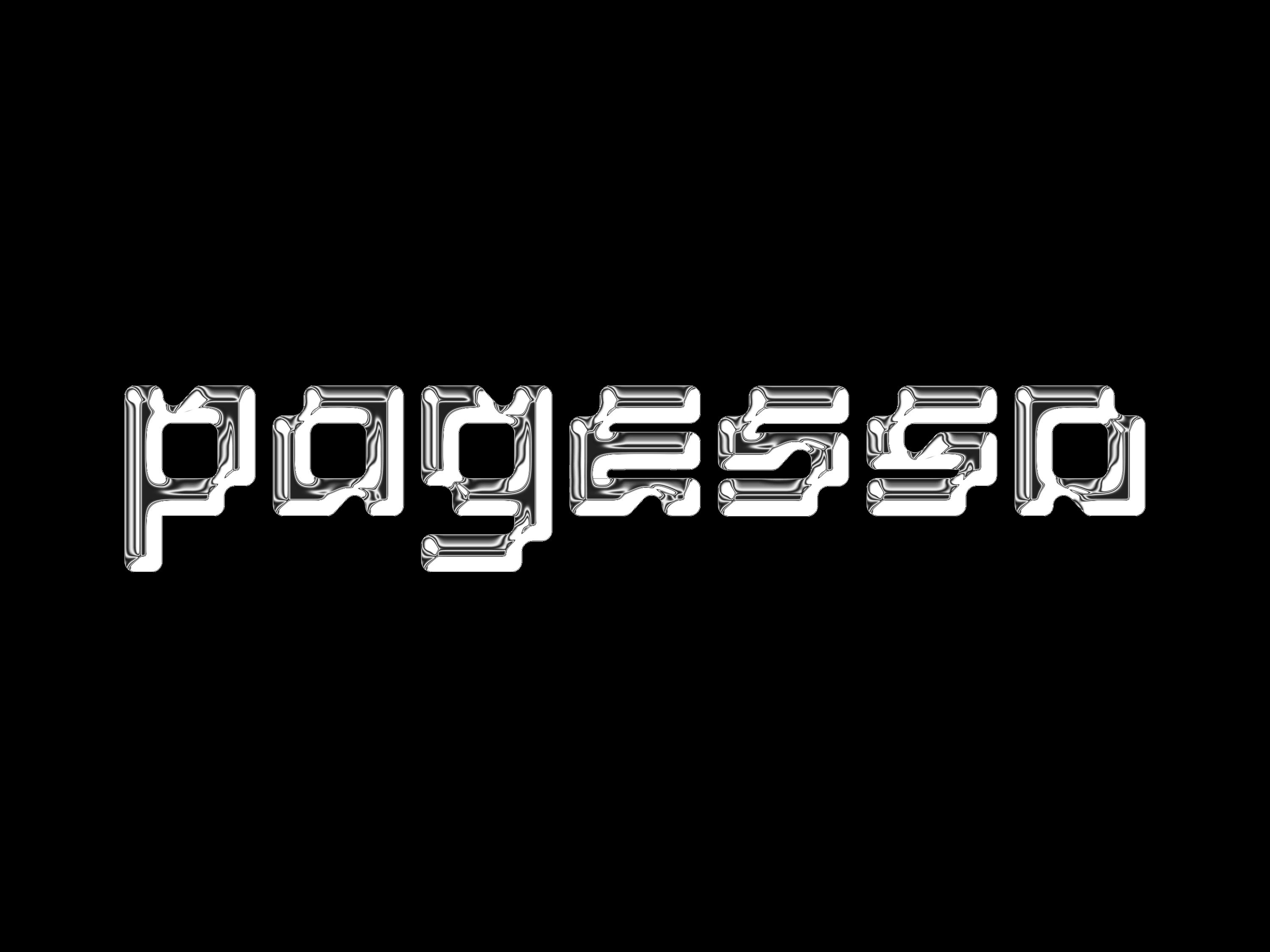
Route 2 (Concept)
I found a visually intriguing variable typeface where I felt that the contrasting weights on the characters connected with the members of the charity because they all come from different backgrounds and have different problems.
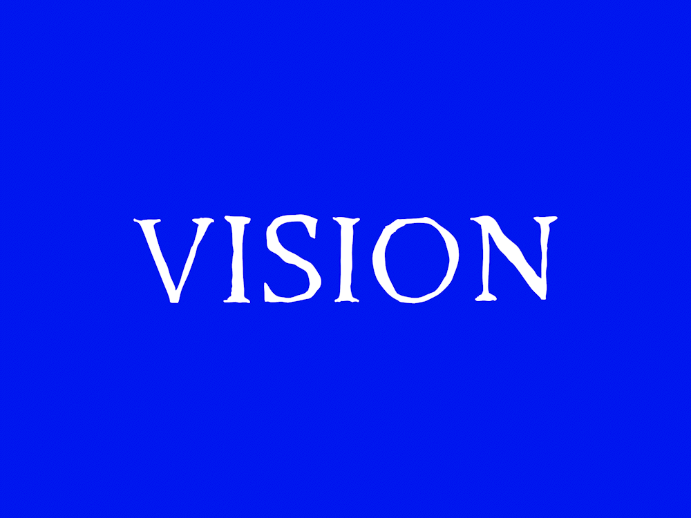
I had a vision of this typeface being used for the animation because it had a weight range from 400–800 so would of been really simple to animate and bring to life, would of looked very cool. However, this design felt more geometric and computer like whereas the other typeface feels more earthy and natural so we chose to focus development on that one as we thought it was stronger, we also did a class vote to check and the high majority agreed.