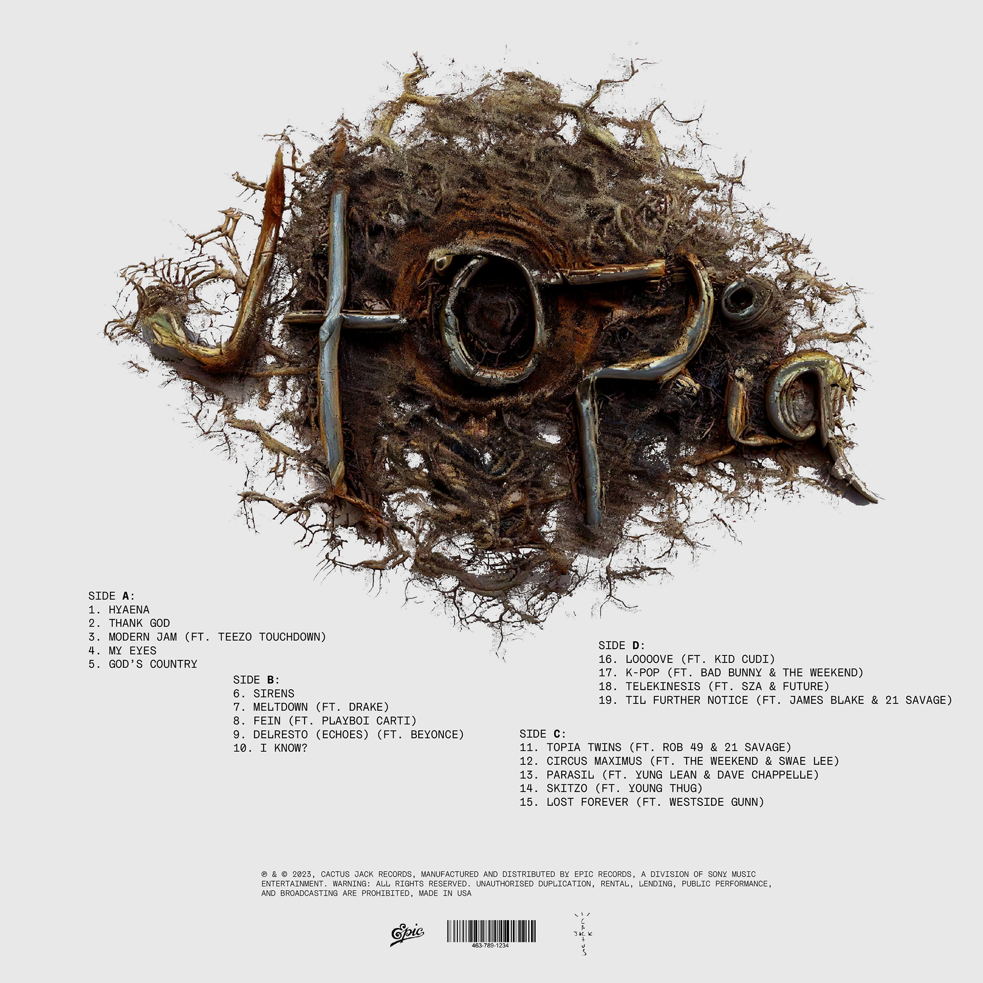
Utopia Vinyl Packaging
In this module, we were free to repackage any product. I chose a vinyl record, which allowed me to combine my love of music with greater creative freedom, regarding the visual direction. Alongside the album redesign I produced a zine and a product sale website as two other deliverables.

Process
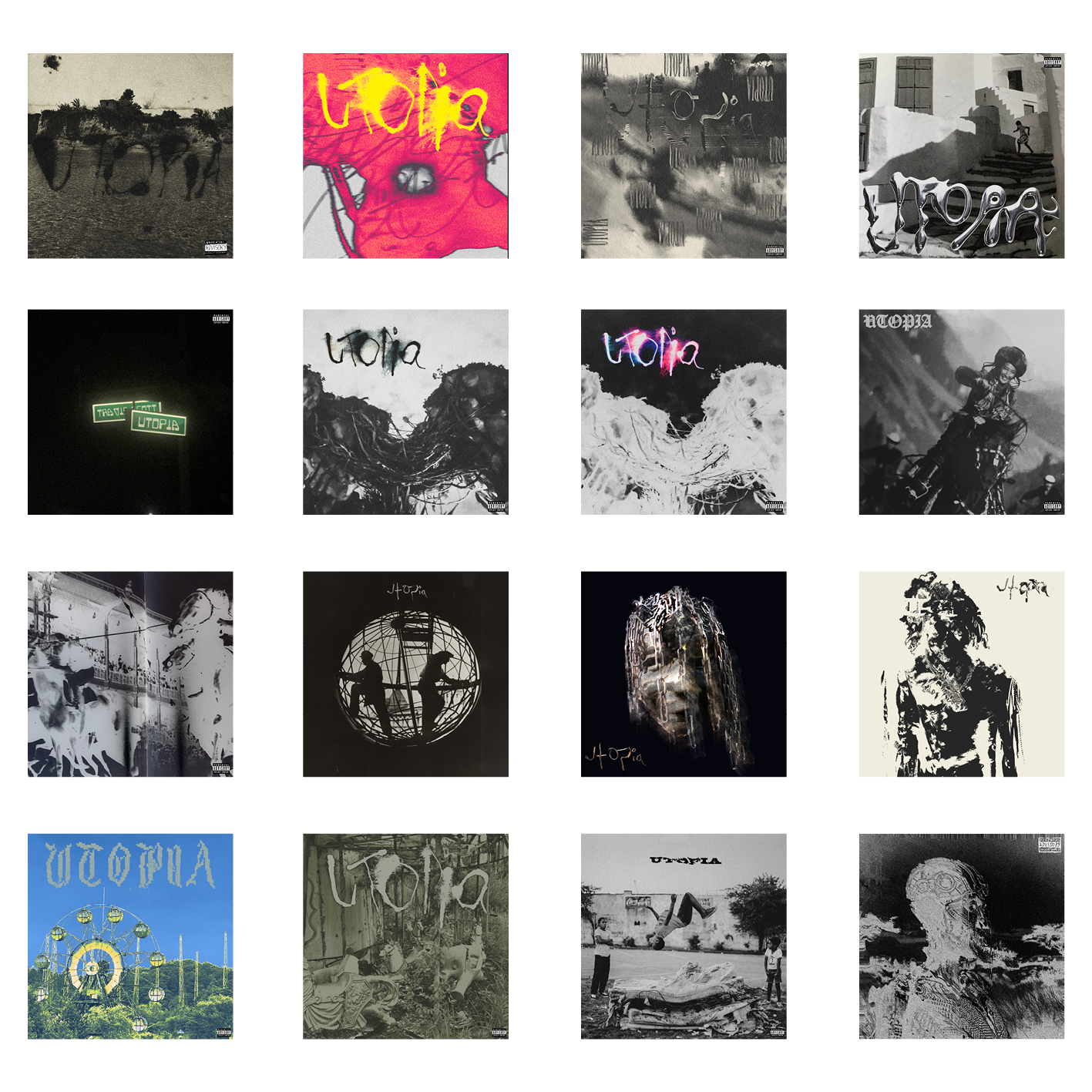
In the first few days I made 38 rapid fire designs, to visualise what the atmosphere of the music and the theme I wanted to go for. I found imagery from magazines, photos from my phone, and we were encouraged to use Adobe Firefly to experiment designing with AI. The only image here that was created with AI was the last one, this design laid down the foundations and I built off it.
I chose three words to describe how the album listening experience made me feel. I chose experimental, dystopian, and imperfect. I had these three words in my mind when designing as if I was designing for a brand with those values.
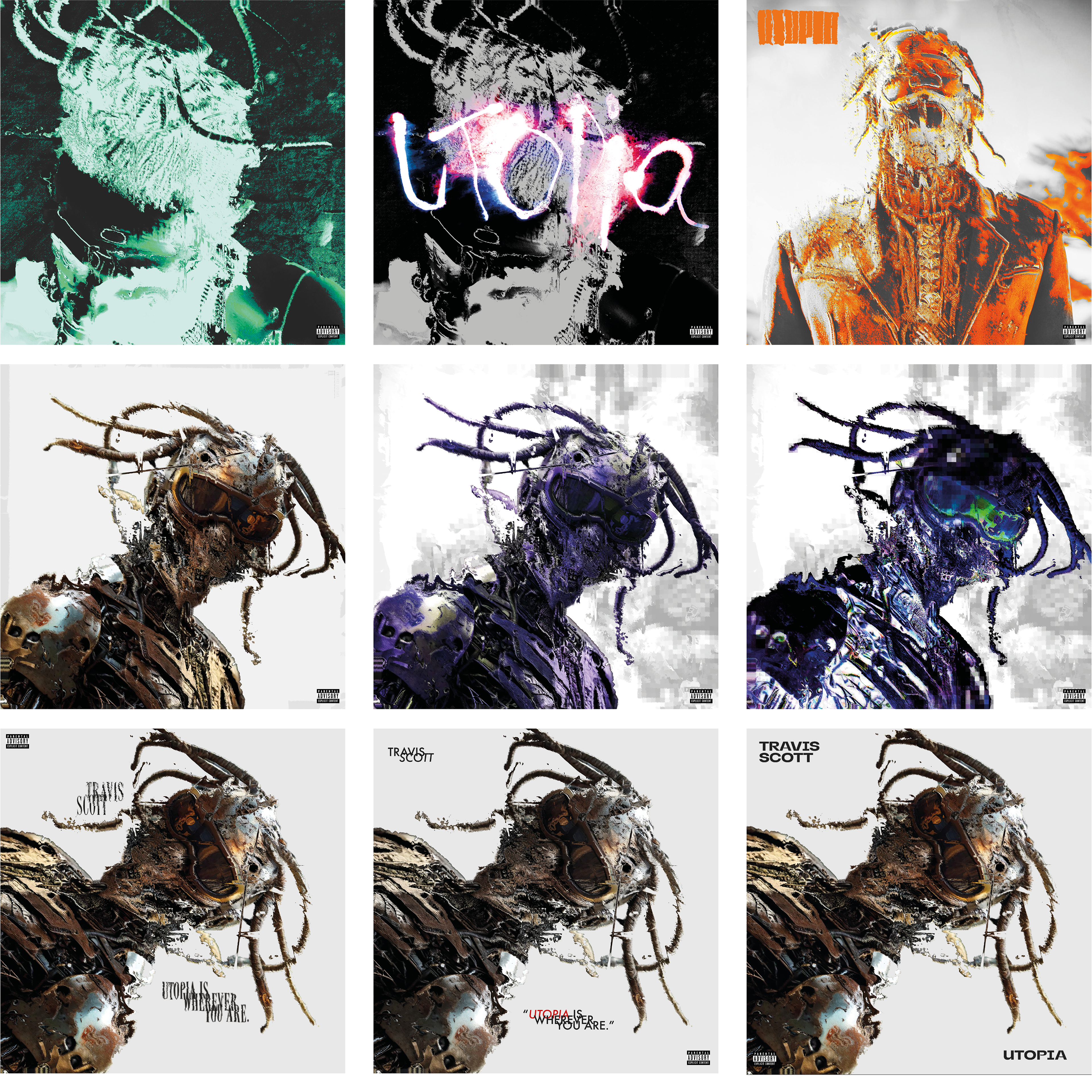
I kept experimenting with AI prompts throughout the scope of the project. This is where the visual direction started to solidify, allowing me to refine compositions, textures, and typography that aligned with the tone of
the album.
the album.
See below for the development.
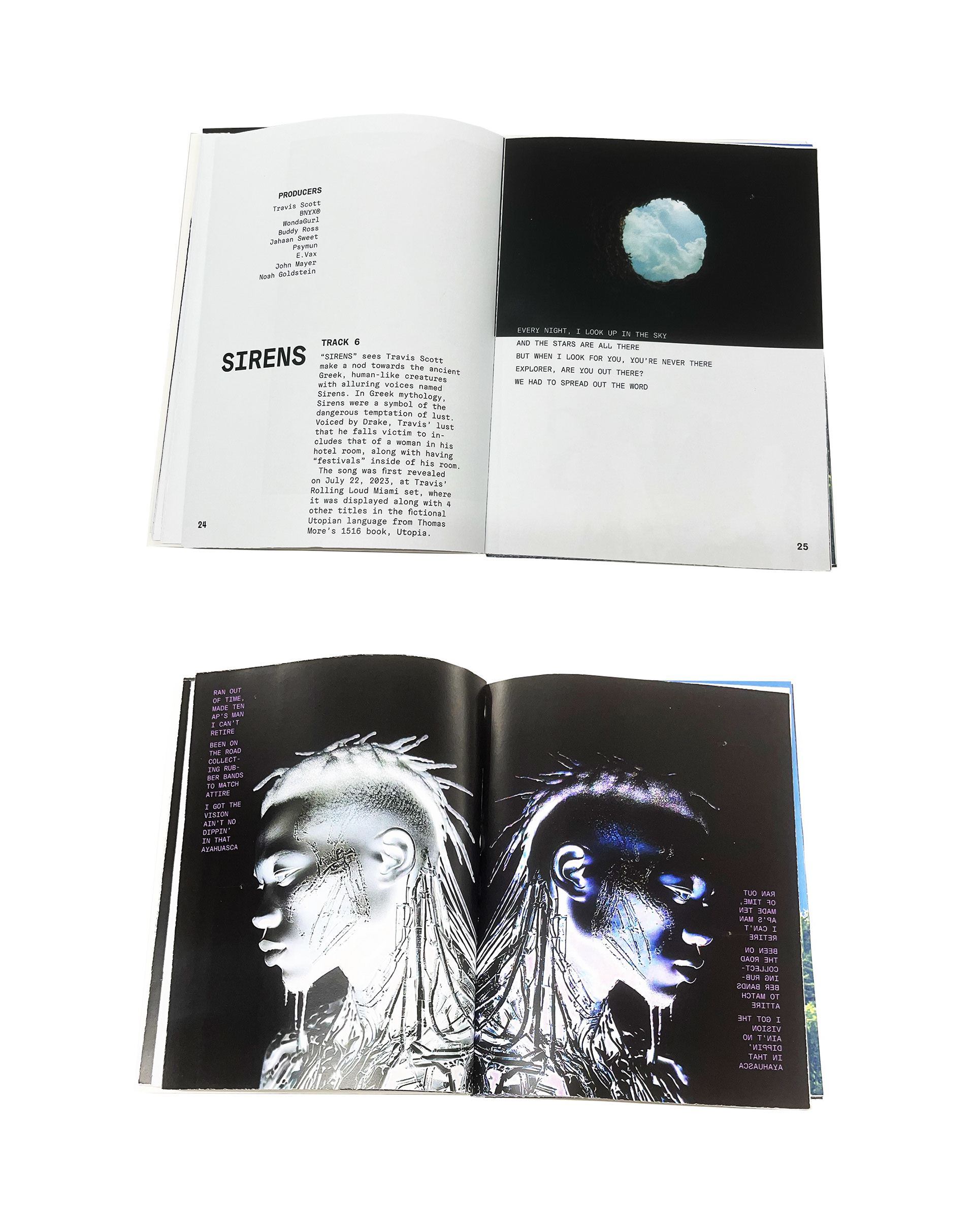
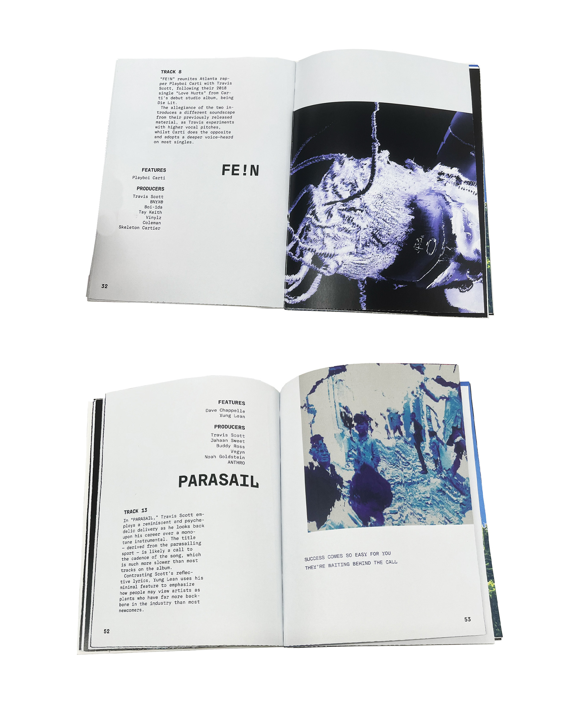
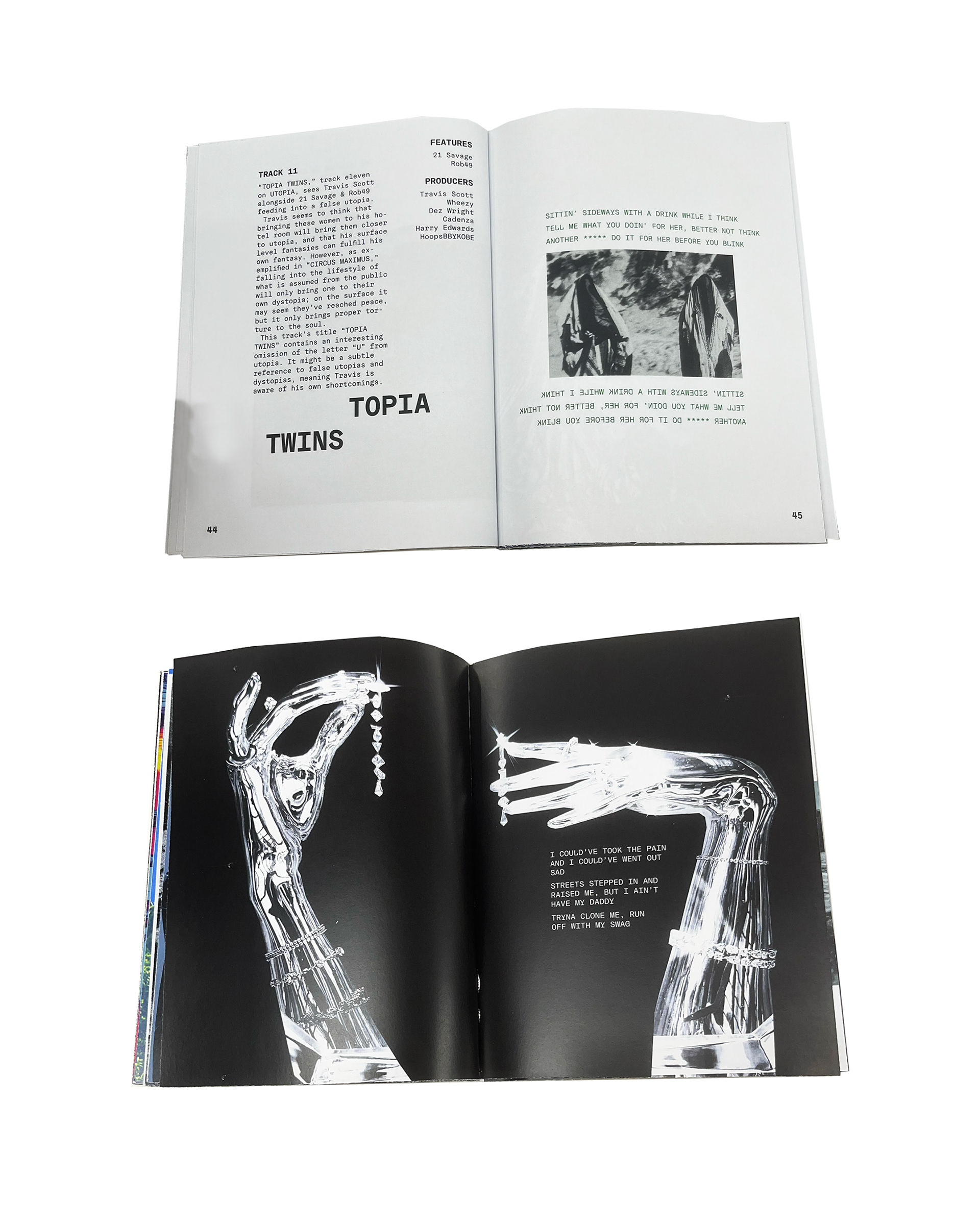
Outcome
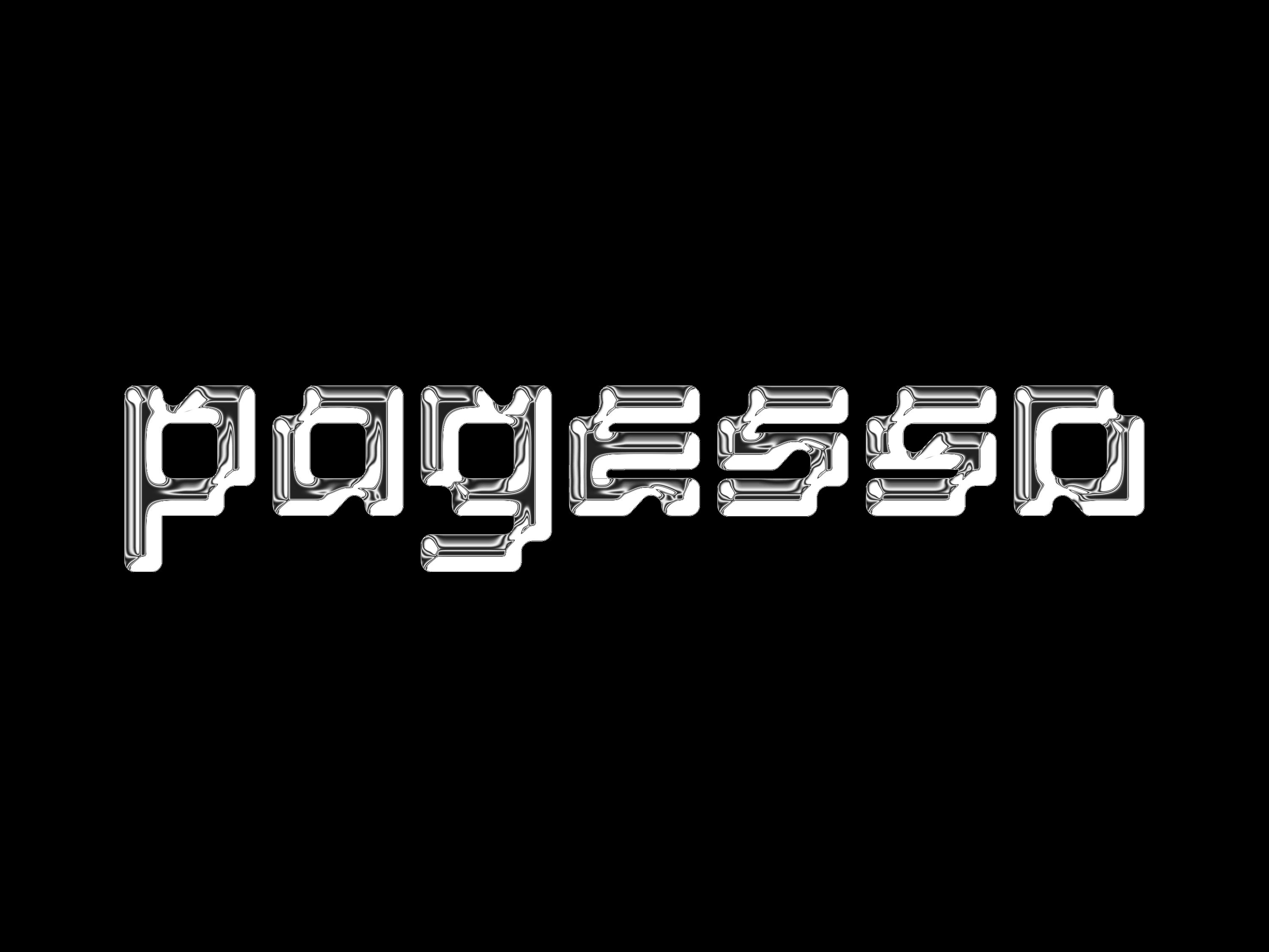
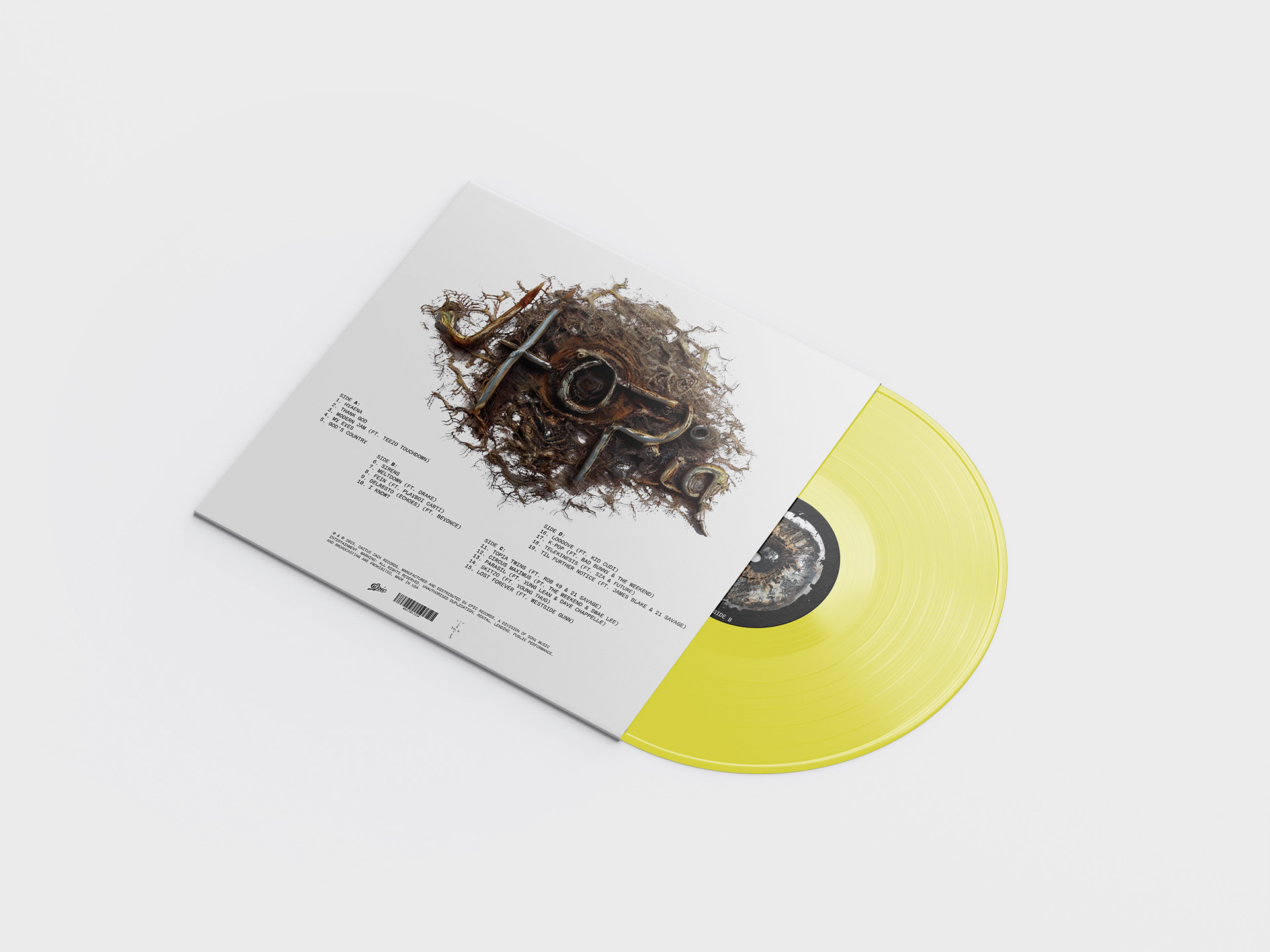
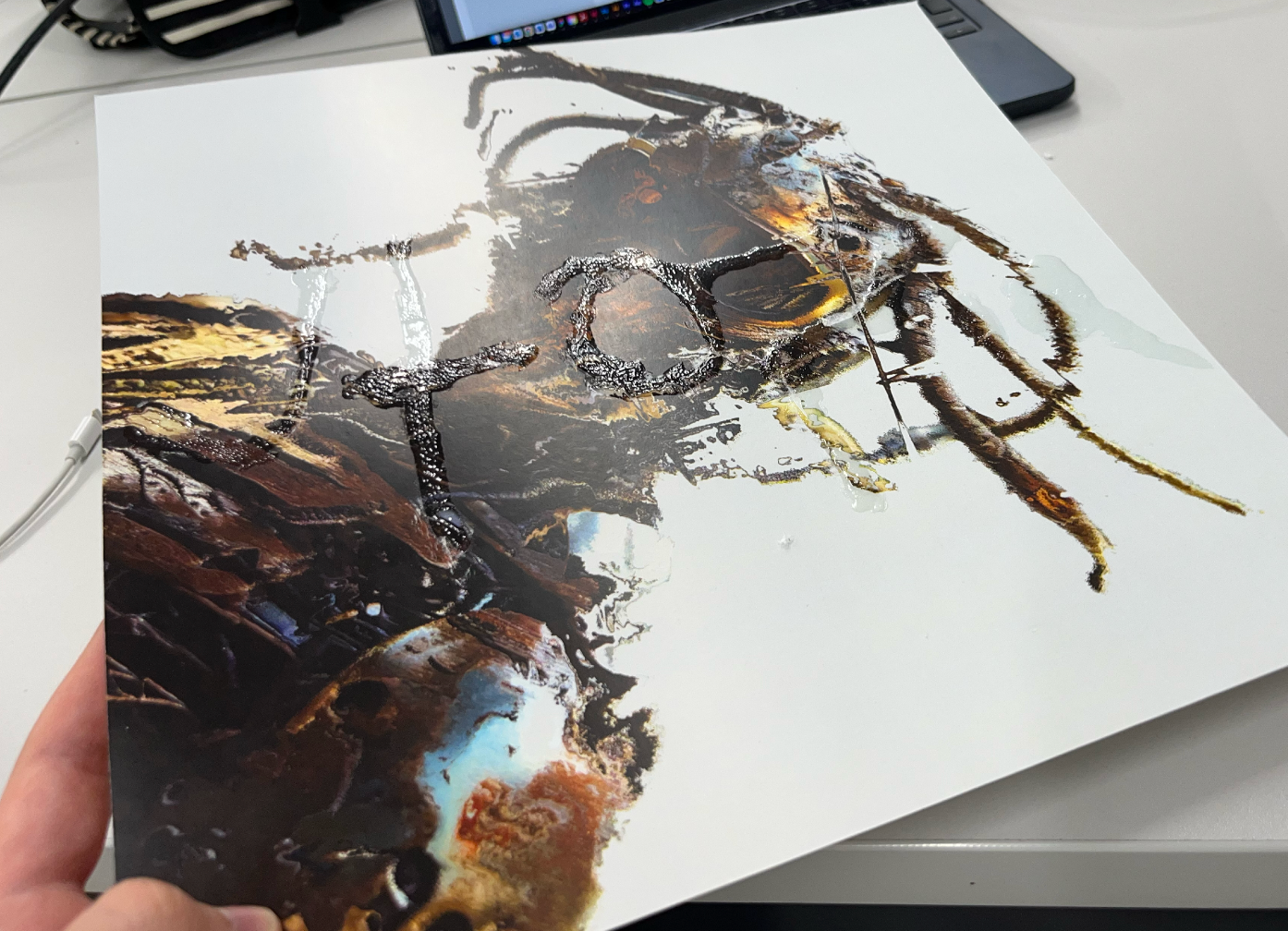
Utilising a cricut, I added a clear gloss finish with the handmade type that I also have on the back cover.
The meaning behind the album is ‘Utopia is wherever you are’ and you can only read ‘Utopia’ on the vinyl cover in the right light. So it’s not where you are it’s how you look at things. This transfers the listener into the world of the music.
The meaning behind the album is ‘Utopia is wherever you are’ and you can only read ‘Utopia’ on the vinyl cover in the right light. So it’s not where you are it’s how you look at things. This transfers the listener into the world of the music.
This project successfully repackages the album by translating its dark, experimental atmosphere into a dystopian visual identity. The rough, grungy imagery and distorted half-robot portrayal of Travis Scott reflect imperfection and futurism, while the angled composition, raw textures, and muted brown tones move away from polished, conventional hip-hop aesthetics. Experimental typography and an unstructured, grid-free layout further break industry norms, mirroring the album’s unconventional sound. Familiar elements such as Travis Scott’s silhouette and dreads maintain recognisability for fans, while movement and distortion connect to the energy of the music. The use of whitespace reinforces the album’s message that “Utopia is wherever you are”.
Which invites listeners to project their own imagination onto the design, making the outcome both conceptually strong and visually distinctive.
Which invites listeners to project their own imagination onto the design, making the outcome both conceptually strong and visually distinctive.

Front cover